GRO ROT Naturlig foda
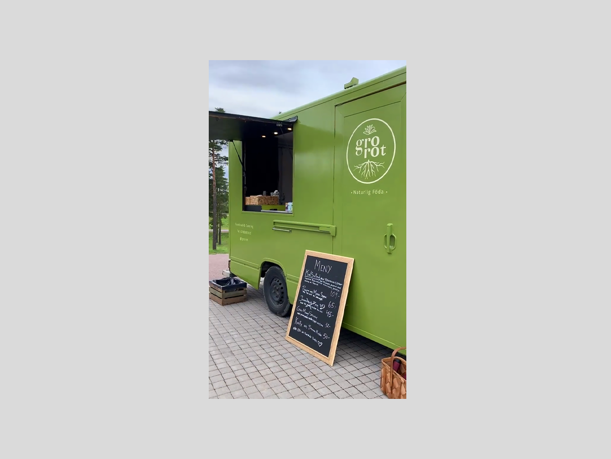
Gro Rot Naturlig Föda is a plant-based food truck based in Sweden.
Brand Design, Marketing

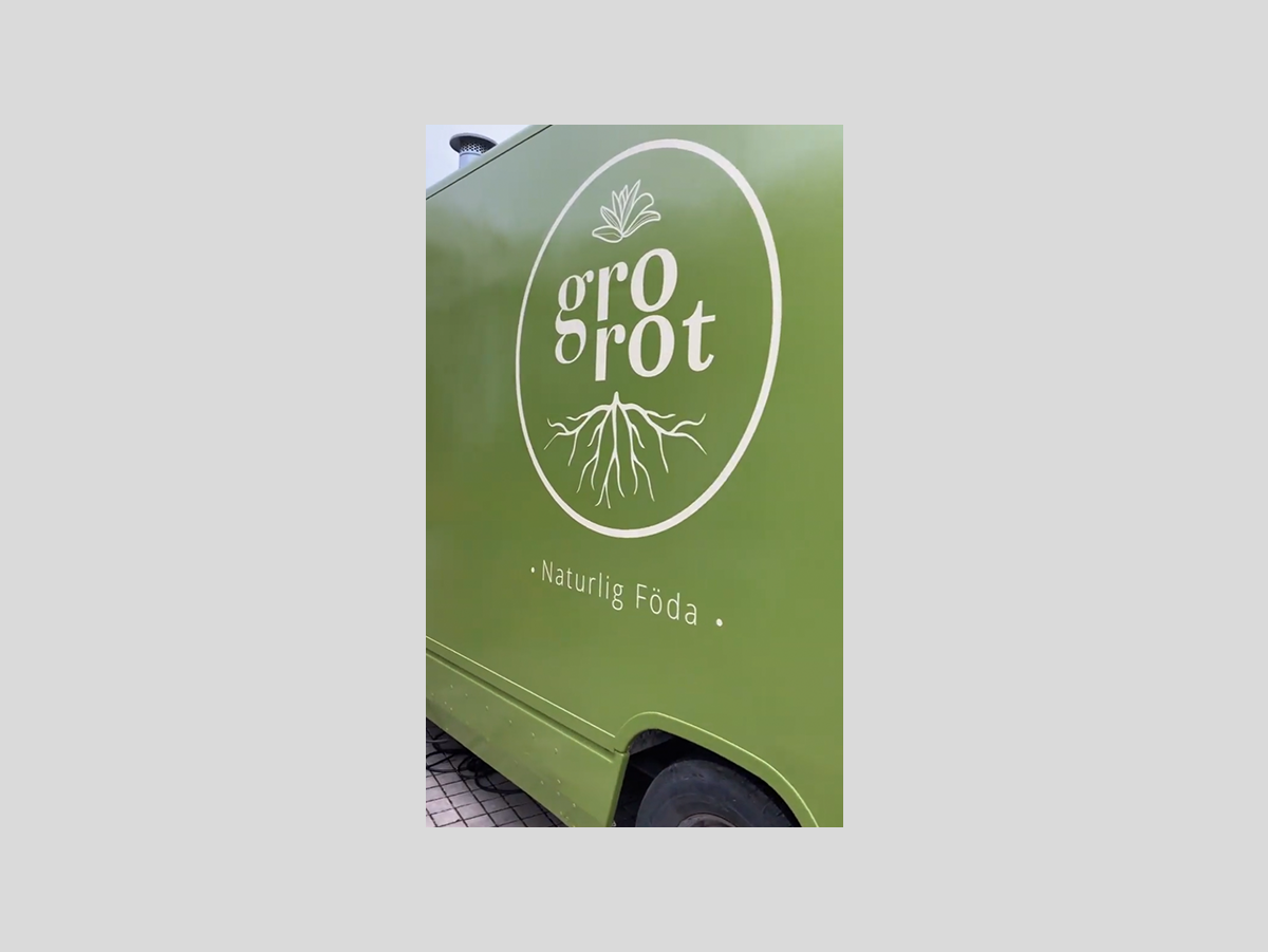
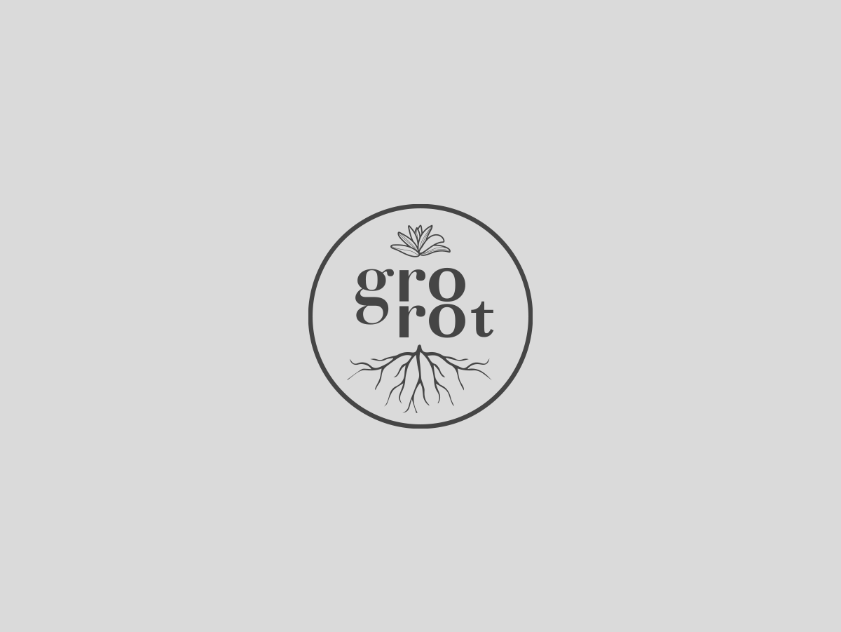
the story behind the logomark
Gro Rot, meaning "to take root" is reflected in the logomark through the roots growing from the herbs represented above the logotype. The collaboration of these two illustrations symbolizes healing with food, herbs, and energy.
A message through the color palette
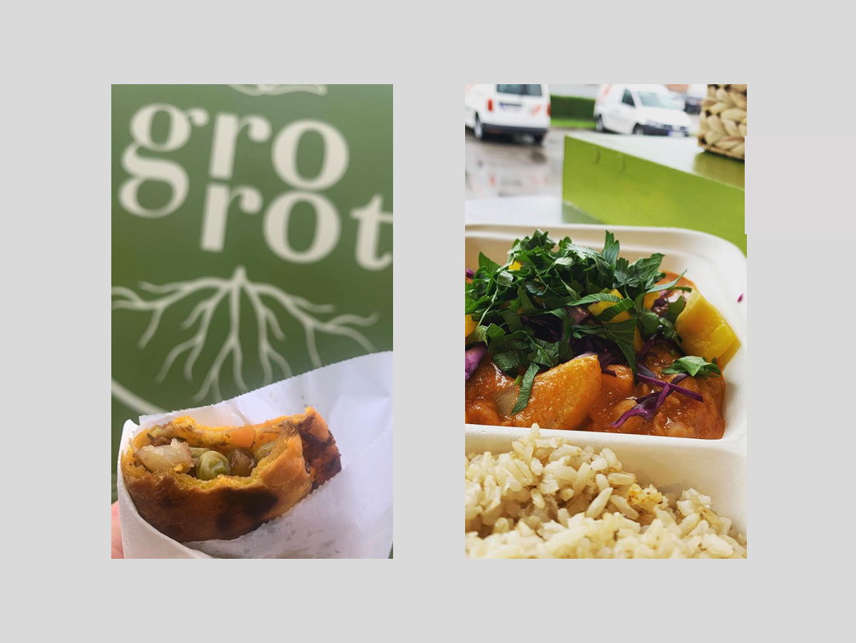
The brand identity needed to convey trustworthiness in terms of color. Following my brand research on market and design trends in organic, natural food, I created a fresh and modern feel through the color palette, using warm, earthy colors.

Applying the brand design to marketing material
To make an impact on a larger scale, the logomark needed to be clean and simple yet dynamic.